Tiny Minds Lab —
Tinky — The preschool teacher's best friend is
smart, personal and digital.
2021
![]()
![]()
![]()
![]()
![]()
![]()
![]()
![]()


— The Client
Tiny Minds Lab are a Stockholm based pre-k EdTech start-up.
— The Product
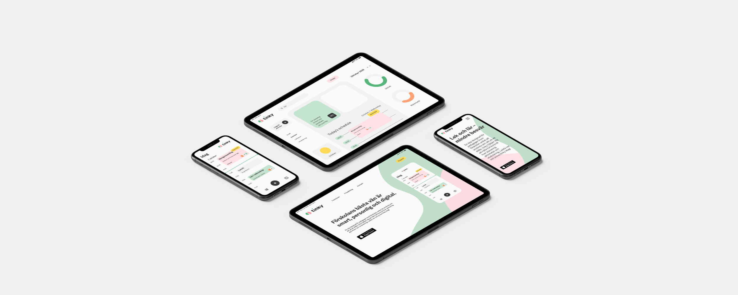
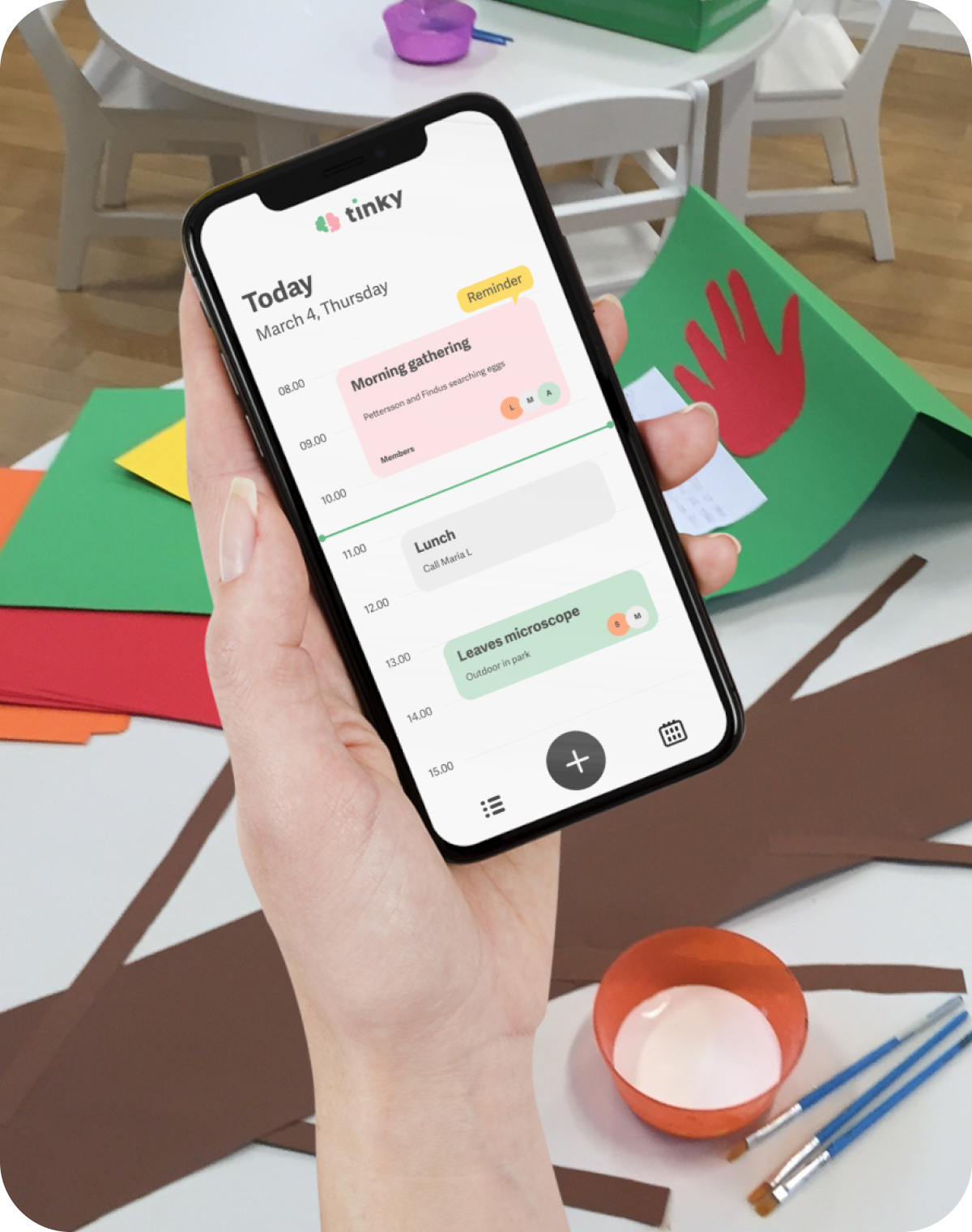
Tinky is a multifunctional digital tool focused on optimising preschool education for children. It combines organisational functions with educational content to create a one-stop-shop that simplifies preschool teachers' everyday administrative chores.
Tinky is built to meet the needs of the future as well as the new requirements set out by the Swedish government (Lpfö18), which require digital tools to be included in the learning environment from a young age.
Tinky is built to meet the needs of the future as well as the new requirements set out by the Swedish government (Lpfö18), which require digital tools to be included in the learning environment from a young age.
— The Users
Preschool teachers in the Swedish educational system.
Visual Identity & Experience for Tinky
My Role
User Research
Brand Strategy
Visual Design
User Interface in app
Ideation Facilitation
The Team
Client Relations - Francisco Palavecino
Business Analyst - Thomas Hana
UX Researcher/UI - Ido Shevet
Tools
Quantitative and qualitative research
Notion documentation
Figma UI/prototyping and presentation
Photoshop UI design
Illustrator UI design
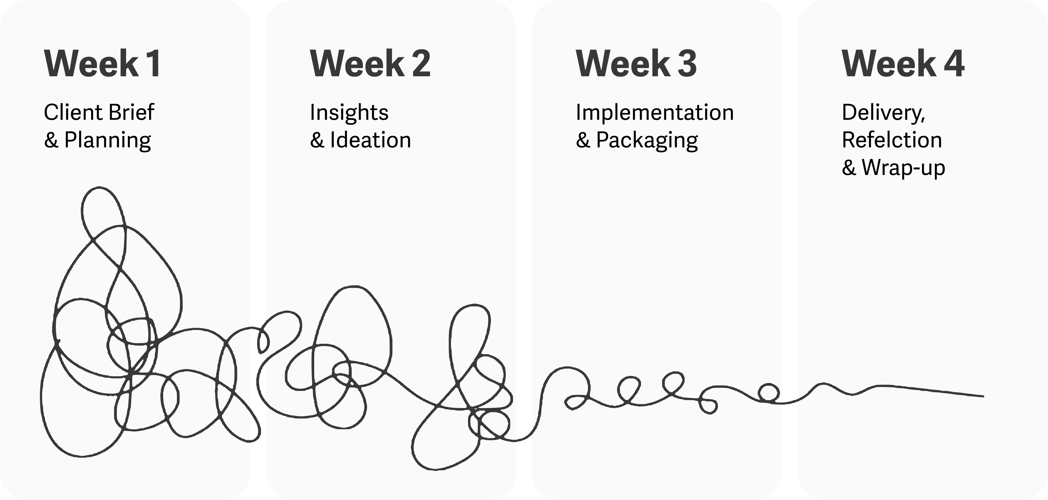
Timeline
4 weeks
Goal
To help Tiny Minds Lab take their brand to the next level.
This will be done by creating a visual identity which enables communication to the target group across all channels.
To suggest possible tech solutions for Tinky’s content platforms, to allow growth and usability to the product.
Process
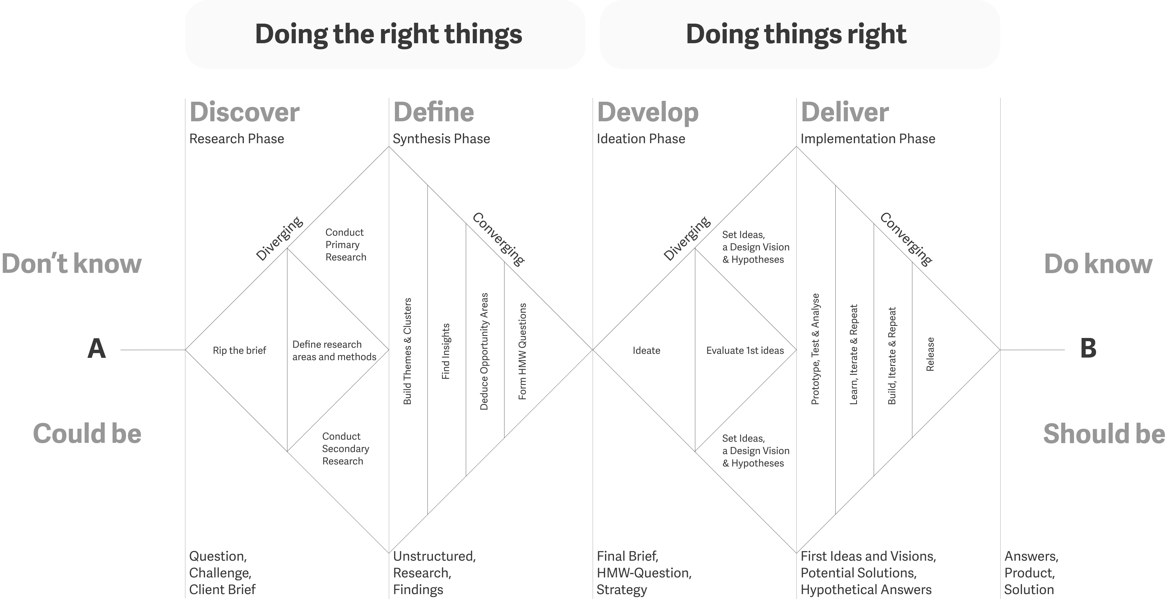
A user-focused iterative design thinking process was divided into this 4 weeks project.
Ideation models "Negative Brainstorming", "How Might We" and "Double Diamond" were used at an early stage of the project to build a strong foundation and for us to define and align on what Tinky is.
Understanding the User
Preschool teachers pointed out that it is important to understand that the kids are producers and not consumers of digital content in preschool.
This was an important early take away.
Values
Our competitive analysis show that Tinky can take a leading role on the market by focusing on the soft values in their communication.
Equality for all children.
Accessible, intuitive and efficient.
One tool doesn't fit all.
Collaborative Ideation
At the mid point of the project, after empathising and defining the problem; based on our research, it was time to initiate the ideation process.
I’ve designed and facilitated a collaborative ideation session, that included the team and the client, to align everyone on our how-might-we questions so we could generate creative solutions while keeping teams focused on the right problems to solve.
In the workshop we’ve explored the user journey, went through “the 5 whys” to breakdown our HMW questions and done a “mash up” exercise to come up with some creative solutions.
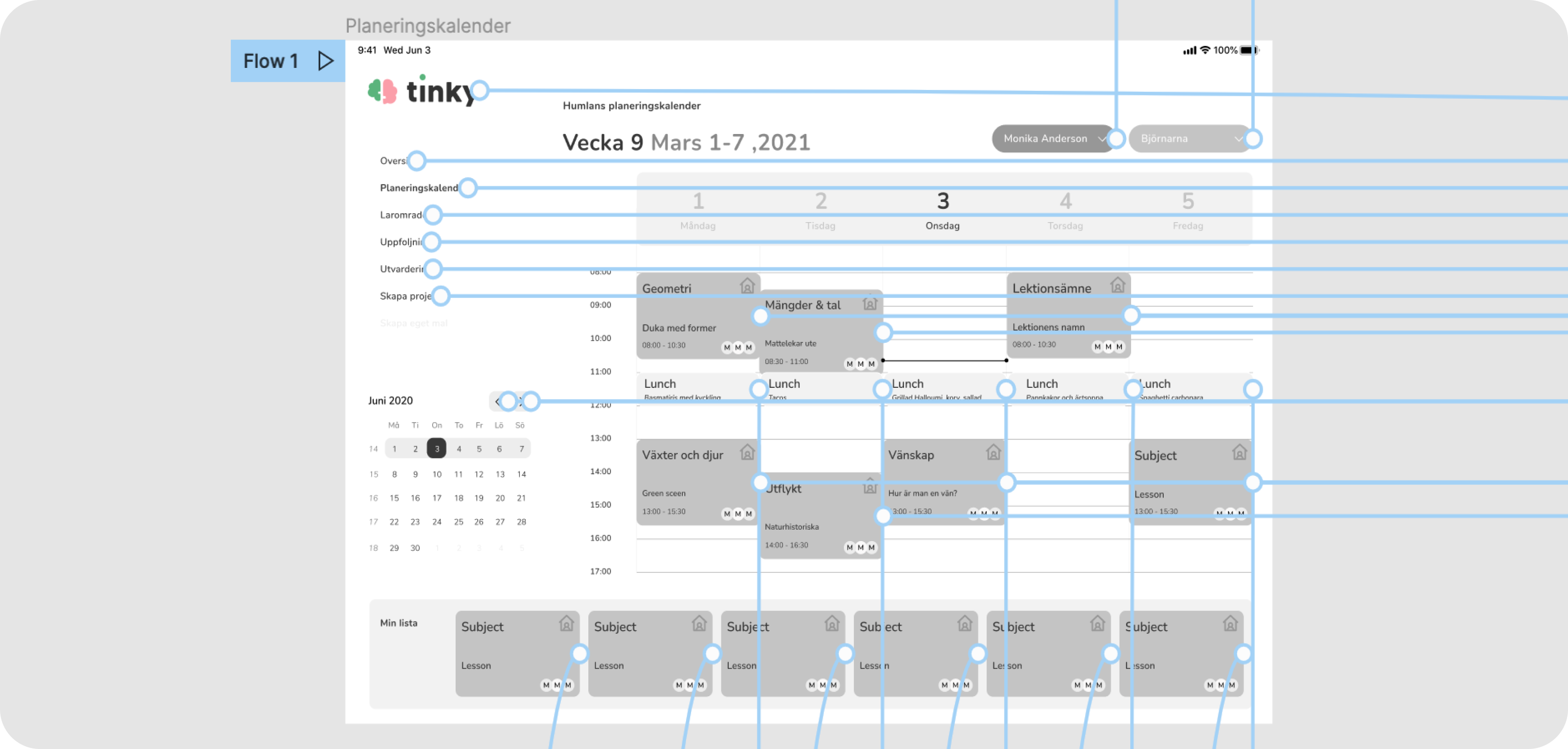
Prototyping
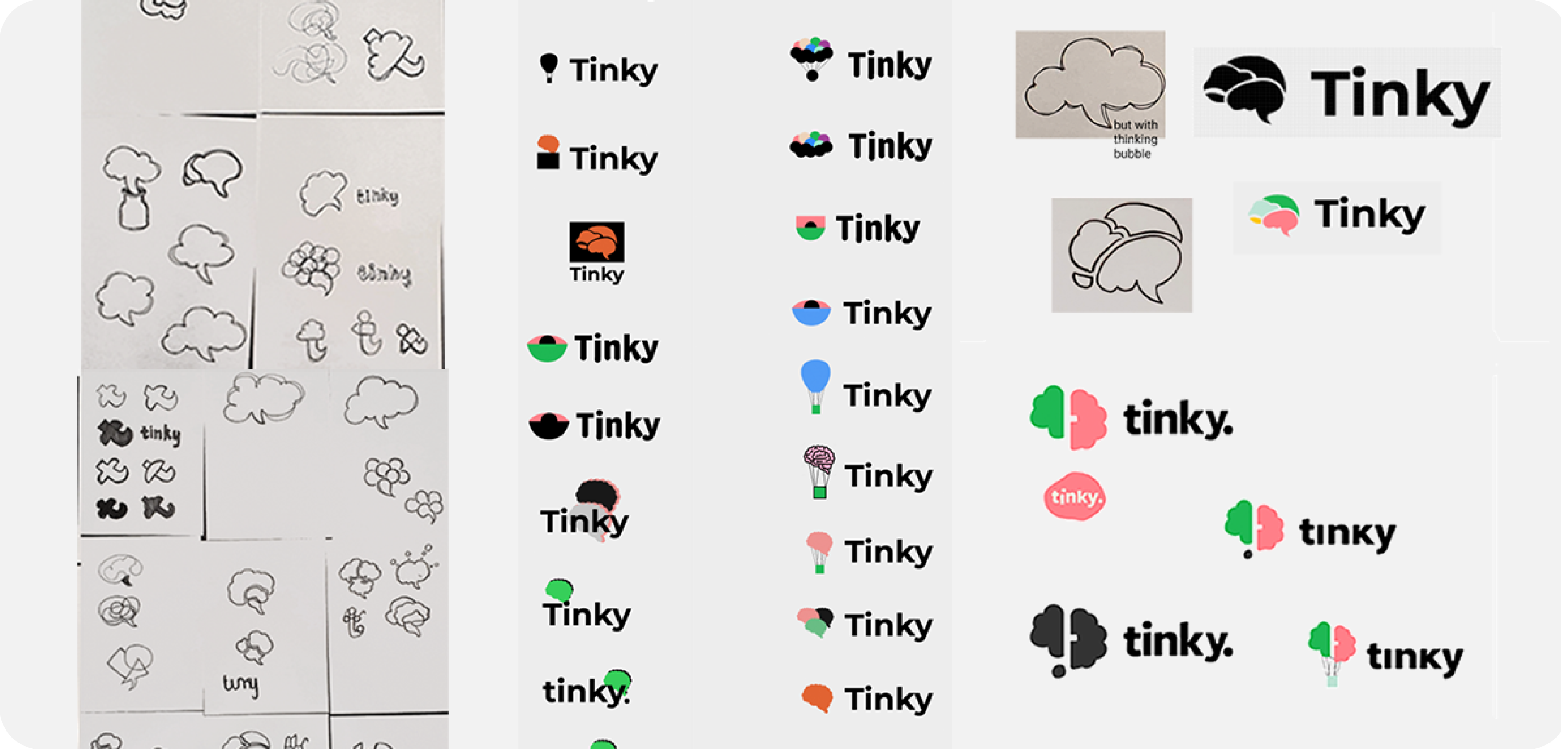
After evaluting the ideas that came up in the ideation session, a strategy for the design vision and hypotheses to tackle was set in place. A direction for the UI was chosen, with logotype, colors, typography and tone of voice.
The team collaborated on figma to create a basic prototype of the app, where some of the main features could be tested and validated.
The team focused on exploring UX for a recommendation system on the content platform and basic features on the organisational functions of the app.
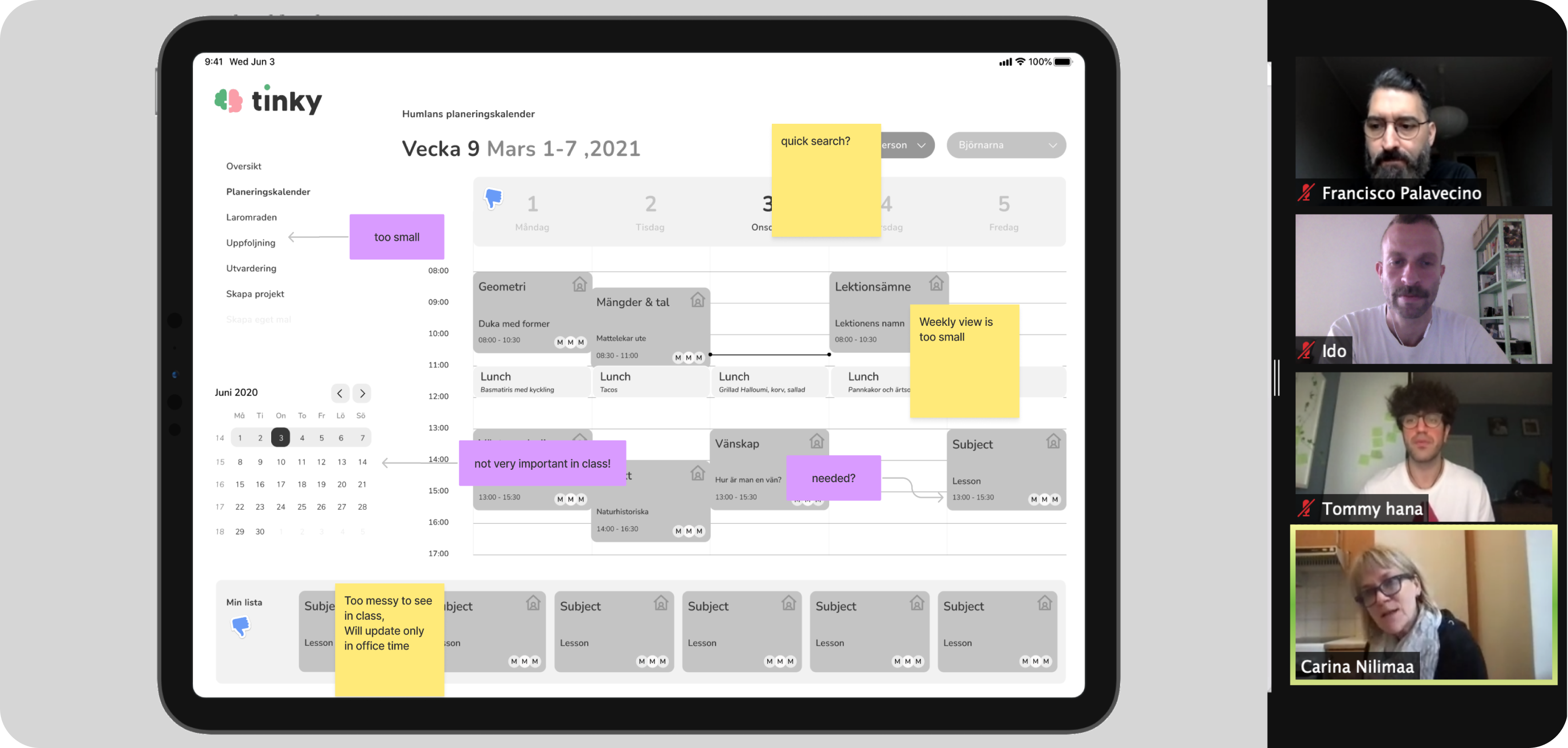
Test
In this project quick testing was an important part of the process as the timeline forced us to have a lot of short deadlines. Having a group of preschool teachers able to test the prototype and hypotheses was a crucial part of this design, as they were able to experience the app in the preschool enviorment and provide amazing feedback regarding their reality. This allowed the team to quickly iterate the product to suit their needs.
Delivery
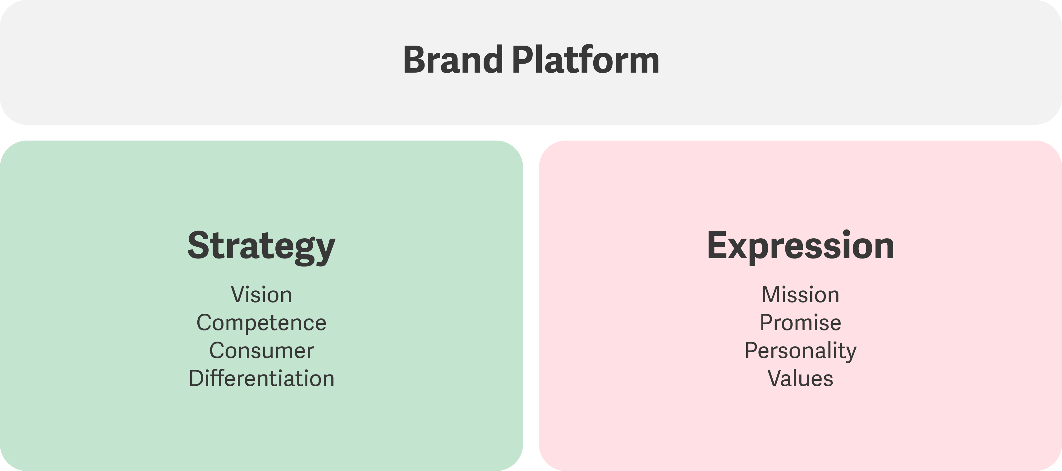
The solution for the project was a brand guide explaining the design decisions and how to communicate the brand correctly, the guide included brand definition, brand pillars, personality, tone of voice, logotype, typography, colors, iconography and design for some of the app’s screens.
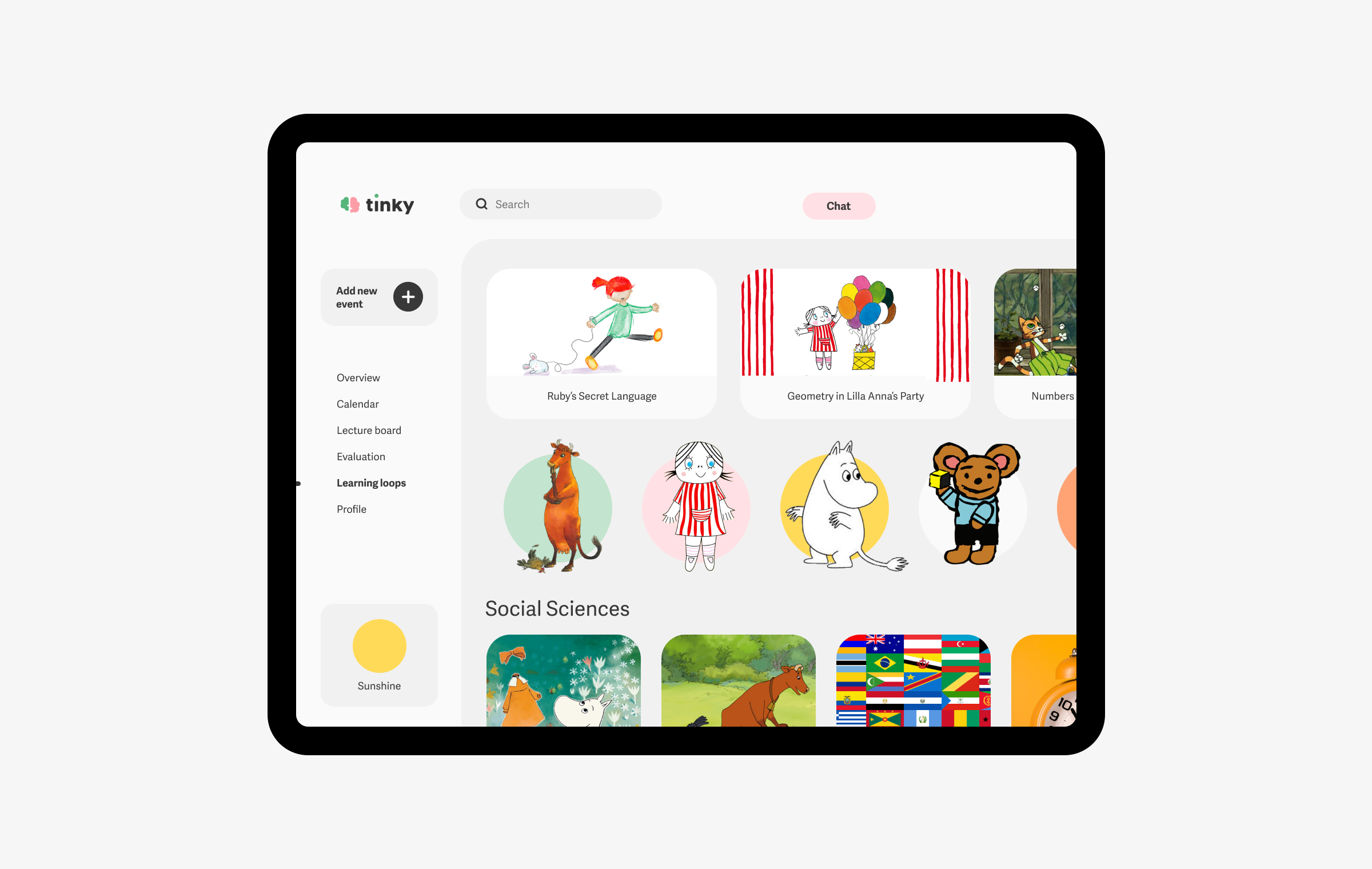
In addition a recommendation system was designed for Tinky’s content platform.
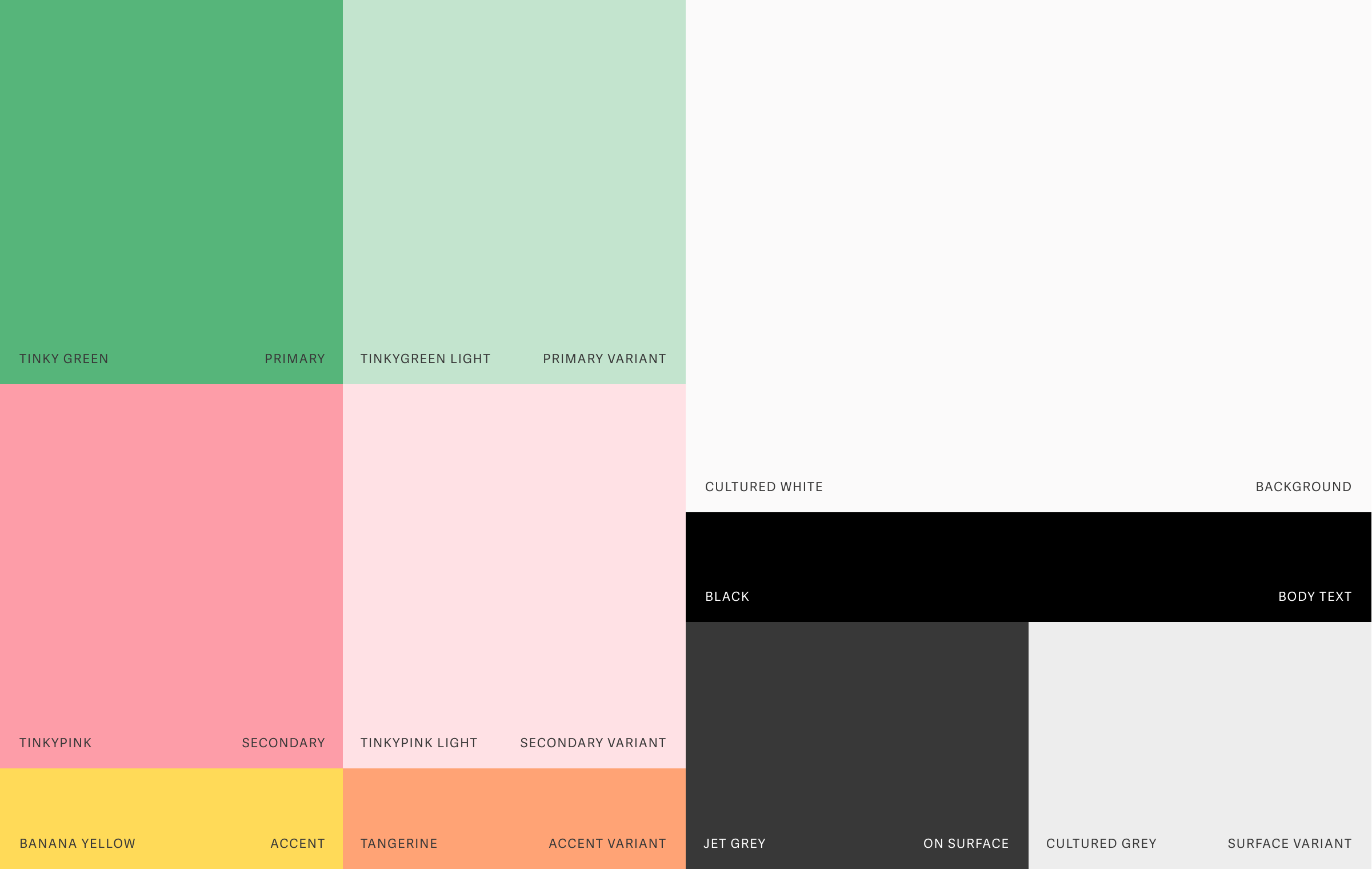
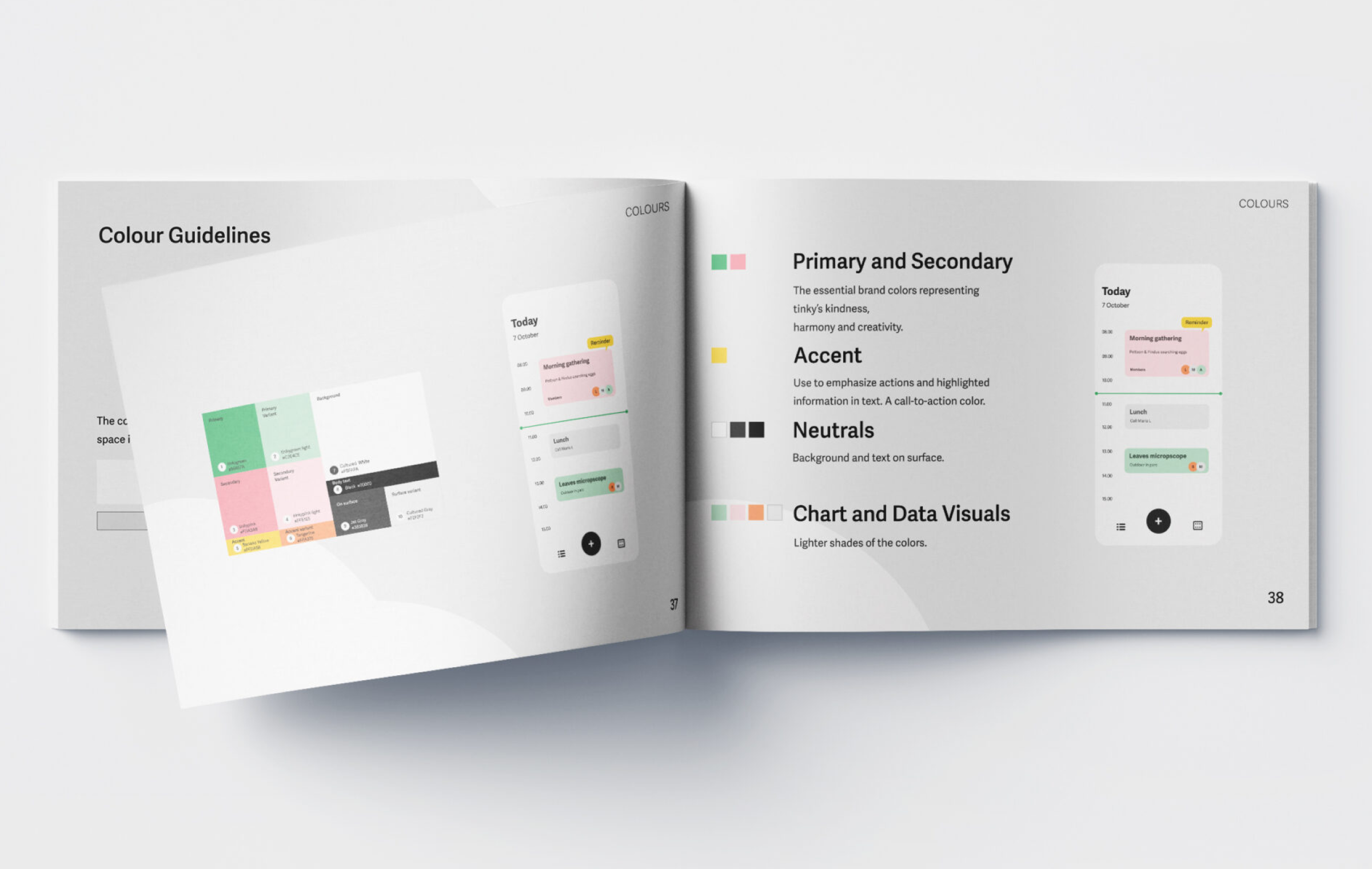
The color palette represents the two different aspects of tinky as a tool - organization and creativity. The combination of the left and right side of the brain merges the rational with the imaginative in a playful way.
My Role
As I have a long experience of working with color in my past design positions as a print designer I took the responsibility of color in the team.
I also choose to use the 60% + 30% + 10% concept of color balance to give the interface harmony. 60% of neutrals, 30% of background surface colors and 10% accents.
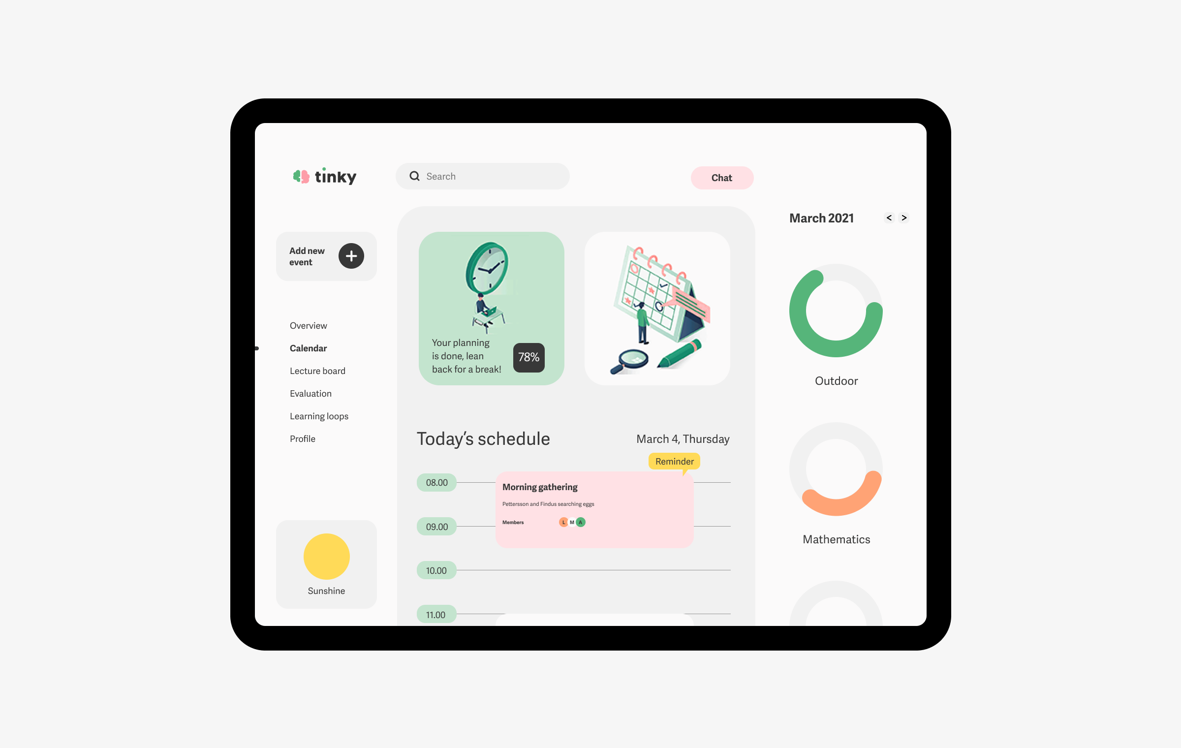
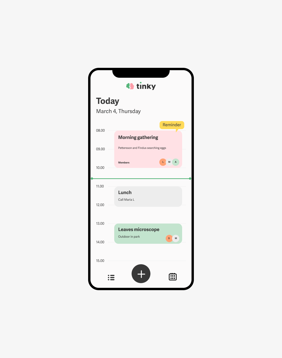
I was responsible for the app design and incorparating the recommendation system into the platform.
Learnings
My biggest learnings was how to use strategy and expression to communicate a brand like Tinky. How close branding is to UX, the importance of understanding the users behaviour, goal and challenges in the use of digital tools in the environment surrounded by kids.
I also learned how clear communication and involving the client in each step along the help push the design process forward.